Please Note: This article is written for users of the following Microsoft Word versions: 2007, 2010, 2013, 2016, 2019, 2021, 2024, and Word in Microsoft 365. If you are using an earlier version (Word 2003 or earlier), this tip may not work for you. For a version of this tip written specifically for earlier versions of Word, click here: Understanding Monospace Fonts.
In general, there are two types of fonts. The first is proportional space, and the second is monospace. Proportional space fonts are designed so every letter only occupies the minimum horizontal space necessary for the letter. Thus, an "i" takes less space than a "w." Monospace typefaces, on the other hand, are designed so every letter and character takes the same amount of horizontal space. If you have ever spent any time working on typewriters, then you are familiar with monospace fonts—the vast majority of fonts used by typewriters fall into this category.
Most of the fonts installed on a Windows system are proportional. One monospace font that should be on a Windows system, however, is Courier New. If you want to install other monospace fonts, then you simply need to search for "monospace fonts," without the quote marks. You can find a starting list of monospace fonts at this Wikipedia page:
https://en.wikipedia.org/wiki/List_of_monospaced_typefaces
WordTips is your source for cost-effective Microsoft Word training. (Microsoft Word is the most popular word processing software in the world.) This tip (11461) applies to Microsoft Word 2007, 2010, 2013, 2016, 2019, 2021, 2024, and Word in Microsoft 365. You can find a version of this tip for the older menu interface of Word here: Understanding Monospace Fonts.
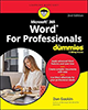
Do More in Less Time! An easy-to-understand guide to the more advanced features available in the Microsoft 365 version of Word. Enhance the quality of your documents and boost productivity in any field with this in-depth resource. Complete your Word-related tasks more efficiently as you unlock lesser-known tools and learn to quickly access the features you need. Check out Microsoft 365 Word For Professionals For Dummies today!
Want to adjust the pitch of your text? The answer depends on what, exactly, is meant by "pitch." This tip looks at the ...
Discover MoreA quick little shortcut can help you easily step through different font sizes for whatever text you've selected. Word ...
Discover MoreWant a way to change the color of your text through a shortcut key? You can do so by using the macros described in this tip.
Discover MoreFREE SERVICE: Get tips like this every week in WordTips, a free productivity newsletter. Enter your address and click "Subscribe."
2026-01-11 08:52:33
jamies
Re the Goldman Sans font -
Thanks for that,
At a swift look,
for alignment there seems to be a glitch with spaces, decimal places Currency denotations with "," separators .
2026-01-10 15:42:15
Mike
At the risk of crossing the Word-Excel line, Goldman Sans is a free font designed by Goldman Sachs for use in spreadsheets. While not officially described as monospaced, it is specifically designed to make numbers in spreadsheets line up, which sounds like monospaced. https://www.cdnfonts.com/goldman-sans.font
2026-01-10 06:02:22
jamies
Re selecting fonts -
Beware -
now that MS has been altering Apps to use different codepages as well as languages -
and allowing various ways to "enter" special characters and symbols
do check that a selected font not only handles special characters, but also punctuation as you need -
e.g. the apostrophe appears as that,
not a 4 character string, or 3 characters with a newpage - throw where the apostrophys should be
Got a version of Word that uses the ribbon interface (Word 2007 or later)? This site is for you! If you use an earlier version of Word, visit our WordTips site focusing on the menu interface.
Visit the WordTips channel on YouTube

FREE SERVICE: Get tips like this every week in WordTips, a free productivity newsletter. Enter your address and click "Subscribe."
Copyright © 2026 Sharon Parq Associates, Inc.
 Please Note:
This article is written for users of the following Microsoft Word versions: 2007, 2010, 2013, 2016, 2019, 2021, 2024, and Word in Microsoft 365. If you are using an earlier version (Word 2003 or earlier), this tip may not work for you. For a version of this tip written specifically for earlier versions of Word, click here:
Please Note:
This article is written for users of the following Microsoft Word versions: 2007, 2010, 2013, 2016, 2019, 2021, 2024, and Word in Microsoft 365. If you are using an earlier version (Word 2003 or earlier), this tip may not work for you. For a version of this tip written specifically for earlier versions of Word, click here:
Comments