Please Note: This article is written for users of the following Microsoft Word versions: 2007, 2010, 2013, 2016, 2019, 2021, and Word in Microsoft 365. If you are using an earlier version (Word 2003 or earlier), this tip may not work for you. For a version of this tip written specifically for earlier versions of Word, click here: Using Very Large Font Sizes.
When you are formatting text in your document, one of the things that you can specify is the font size of that text. Each character in your document can be a different font size, if you desire. You specify the size of font to use in points, a typographical measure that is roughly equivalent to 1/72 of an inch. Word supports font sizes from 1 point to 1638 points, which means you can use fonts that are 1/72 of an inch all the way up to 22-3/4 inches.
Don't these sizes deceive you, however? You might expect that if you set a font size to 144 points, you will end up with letters two inches high. You won't. What you really end up with actually depends on the font you selected. Font sizes are measured from the top of the ascenders on a letter (ascenders are the portions of a letter that point upwards) to the bottom of the descenders on a letter (descenders are the portions that point downwards).
This means that except in a few specialty fonts, no single character in the Standard English alphabet will have the full height of the font, because no letter uses both ascenders and descenders. One way to see the full height of the font in one character is to use the lowercase Middle English thorn, a bizarre little character that looks like a combination lowercase b and p. (See Figure 1.) You create the character by holding down the Alt key and pressing 0254 on the numeric keypad. (Don't let go of the Alt key until you finish typing 0254.) Since the character has both a descender and an ascender, you can see the real size of the font.
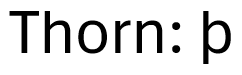
Figure 1. The lowercase thorn character has both an ascender and descender.
The bottom line is that if you want to use very large font sizes and you want to make sure that your letters are a specific size, you will need to play around to figure out which font size is best for you. Pick a letter (perhaps a capital letter X) to be your "reference" letter, and then print some in various sizes. When you find the one that appears to be the size you want, you will then know what point size to make the rest of your characters.
WordTips is your source for cost-effective Microsoft Word training. (Microsoft Word is the most popular word processing software in the world.) This tip (11073) applies to Microsoft Word 2007, 2010, 2013, 2016, 2019, 2021, and Word in Microsoft 365. You can find a version of this tip for the older menu interface of Word here: Using Very Large Font Sizes.
Create Custom Apps with VBA! Discover how to extend the capabilities of Office 365 applications with VBA programming. Written in clear terms and understandable language, the book includes systematic tutorials and contains both intermediate and advanced content for experienced VB developers. Designed to be comprehensive, the book addresses not just one Office application, but the entire Office suite. Check out Mastering VBA for Microsoft Office 365 today!
Want your text to always appear in uppercase, regardless of how you type it? Word allows you to add formatting to your ...
Discover MoreWant a way to change the color of your text through a shortcut key? You can do so by using the macros described in this tip.
Discover MoreHighlighting text, using the Highlight tool, is a great way to mark up a document. Normally you need to use the toolbar ...
Discover MoreFREE SERVICE: Get tips like this every week in WordTips, a free productivity newsletter. Enter your address and click "Subscribe."
There are currently no comments for this tip. (Be the first to leave your comment—just use the simple form above!)
Got a version of Word that uses the ribbon interface (Word 2007 or later)? This site is for you! If you use an earlier version of Word, visit our WordTips site focusing on the menu interface.
Visit the WordTips channel on YouTube

FREE SERVICE: Get tips like this every week in WordTips, a free productivity newsletter. Enter your address and click "Subscribe."
Copyright © 2026 Sharon Parq Associates, Inc.
 Please Note:
This article is written for users of the following Microsoft Word versions: 2007, 2010, 2013, 2016, 2019, 2021, and Word in Microsoft 365. If you are using an earlier version (Word 2003 or earlier), this tip may not work for you. For a version of this tip written specifically for earlier versions of Word, click here:
Please Note:
This article is written for users of the following Microsoft Word versions: 2007, 2010, 2013, 2016, 2019, 2021, and Word in Microsoft 365. If you are using an earlier version (Word 2003 or earlier), this tip may not work for you. For a version of this tip written specifically for earlier versions of Word, click here:
Comments