Please Note: This article is written for users of the following Microsoft Word versions: 2007, 2010, 2013, 2016, 2019, and 2021. If you are using an earlier version (Word 2003 or earlier), this tip may not work for you. For a version of this tip written specifically for earlier versions of Word, click here: Smushing Text Together.
Written by Allen Wyatt (last updated August 20, 2024)
This tip applies to Word 2007, 2010, 2013, 2016, 2019, and 2021
I'll bet you already knew that "smushing" is a technical term, right? It is, I believe, a combination of the words "smashing" and "pushing." In this usage, it simply means to squeeze text together by reducing the distance between characters. Typographers refer to this as kerning.
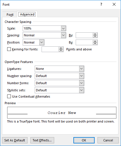
Normally, each font installed on your system has a default distance between characters. This distance is calculated based on the typeface used and on the way the font designer wants the typeface to appear. There are simply times when it is necessary to push text closer together, however. In order to do that, simply follow these steps:

Figure 1. The Advanced tab of the Font dialog box.
WordTips is your source for cost-effective Microsoft Word training. (Microsoft Word is the most popular word processing software in the world.) This tip (12462) applies to Microsoft Word 2007, 2010, 2013, 2016, 2019, and 2021. You can find a version of this tip for the older menu interface of Word here: Smushing Text Together.

Do More in Less Time! An easy-to-understand guide to the more advanced features available in the Microsoft 365 version of Word. Enhance the quality of your documents and boost productivity in any field with this in-depth resource. Complete your Word-related tasks more efficiently as you unlock lesser-known tools and learn to quickly access the features you need. Check out Microsoft 365 Word For Professionals For Dummies today!
If you need to remove any explicit character formatting from some text, you'll want to commit the shortcut in this tip to ...
Discover MoreWhen you create a document (such as a letterhead) that you want multiple people to use, you need to be concerned with ...
Discover MoreIf you have text surrounded by quotes in a document, you may want to remove the quote marks and make the text that was ...
Discover MoreFREE SERVICE: Get tips like this every week in WordTips, a free productivity newsletter. Enter your address and click "Subscribe."
2022-01-15 09:39:43
Erfan
Thanks a lot, this was a life saver for my Thesis
2019-04-28 03:15:36
Anthony
Thanks, Allen. I found this post useful.
2019-02-05 08:29:18
Sheryl Lucas
Andrew, I stand corrected. I honestly never thought of headlines. When I want to condense text, it's usually to fit a line or paragraph of text into a smaller space.
After reading your response, I tested condensing by 1 point for all of Word's font-size presets from 10 to 72 points. At 14 points, condensing text by a full point begins to be reasonable, albeit a bit tight for my taste. It's better at 18 points. At 48 points, condensing by 2 points is reasonable, and at 72 points, 3 points works.
I think it would be a safe assumption that the overwhelming majority of text typed into Word is in the 10 to 12 point range, where condensing by a full point is far too much. I stand by my original assertion that a default of 1 point is unhelpful. (Interestingly, when clicking the up arrow, the condensing is increased in increments of 0.1 point.)
2019-02-04 09:49:35
Andrew
Sheryl, you're probably not considering about display text (headlines, posters, and such, )which are edited at very large size and where variable letter spacing (kerning) can be essential.
2019-02-02 09:52:57
Sheryl Lucas
I use this feature a good bit. When choosing to condense spacing, Word quite *UNhelpfully* defaults to an increment of 1 pt, which I'm quite confident would never in the history of mankind be appropriate, as it has letters overlapping each other. I always start with 0.1 and bump up a tenth of a point at a time until I get what I want. The most I'll ever go is 0.3, and even that is uncomfortably tight.
Is there a way to change the default to 0.1 instead of 1?
Got a version of Word that uses the ribbon interface (Word 2007 or later)? This site is for you! If you use an earlier version of Word, visit our WordTips site focusing on the menu interface.
Visit the WordTips channel on YouTube
FREE SERVICE: Get tips like this every week in WordTips, a free productivity newsletter. Enter your address and click "Subscribe."
Copyright © 2026 Sharon Parq Associates, Inc.
Comments