Please Note: This article is written for users of the following Microsoft Word versions: 2007, 2010, 2013, 2016, 2019, 2021, 2024, and Word in Microsoft 365. If you are using an earlier version (Word 2003 or earlier), this tip may not work for you. For a version of this tip written specifically for earlier versions of Word, click here: Changing Kerning.
Written by Allen Wyatt (last updated January 11, 2025)
This tip applies to Word 2007, 2010, 2013, 2016, 2019, 2021, 2024, and Word in Microsoft 365
When a font is designed, a certain amount of space is designated for inter-character spacing. This spacing determines how close adjacent characters are to each other. Unfortunately, not all characters appear the same width when read on a printed page. Depending on the characters, this can cause an illusion that two characters are spaced too far apart, when in reality they follow the standard spacing conventions for the typeface. This problem normally appears when the left character in a pair has a stroke (a line) that travels diagonally from left to right.
Kerning is a typographical term describing the process of moving letters closer together, in an effort to overcome the illusion of too much space between letters. This makes the text both more appealing and more readable. In Word, kerning can be adjusted either automatically or manually. To change kerning automatically, perform the following steps:
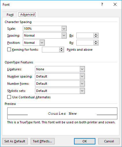
Figure 1. The Advanced tab of the Font dialog box.
In most cases, this type of kerning will be acceptable. There may be instances, however, when you want to manually adjust the kerning between two characters. For instance, you might want to create some special effect for the characters. In these cases, you can manually adjust kerning by following these steps:
WordTips is your source for cost-effective Microsoft Word training. (Microsoft Word is the most popular word processing software in the world.) This tip (12516) applies to Microsoft Word 2007, 2010, 2013, 2016, 2019, 2021, 2024, and Word in Microsoft 365. You can find a version of this tip for the older menu interface of Word here: Changing Kerning.
Do More in Less Time! An easy-to-understand guide to the more advanced features available in the Microsoft 365 version of Word. Enhance the quality of your documents and boost productivity in any field with this in-depth resource. Complete your Word-related tasks more efficiently as you unlock lesser-known tools and learn to quickly access the features you need. Check out Microsoft 365 Word For Professionals For Dummies today!
You can format your text to use some very, very large font sizes. The results you see from formatting with large fonts ...
Discover MoreA quick little shortcut can help you easily step through different font sizes for whatever text you've selected. Word ...
Discover MoreYou can easily use Find and Replace to find text that has a particular format to it. Most people don't know you can use ...
Discover MoreFREE SERVICE: Get tips like this every week in WordTips, a free productivity newsletter. Enter your address and click "Subscribe."
There are currently no comments for this tip. (Be the first to leave your comment—just use the simple form above!)
Got a version of Word that uses the ribbon interface (Word 2007 or later)? This site is for you! If you use an earlier version of Word, visit our WordTips site focusing on the menu interface.
Visit the WordTips channel on YouTube

FREE SERVICE: Get tips like this every week in WordTips, a free productivity newsletter. Enter your address and click "Subscribe."
Copyright © 2025 Sharon Parq Associates, Inc.
 Please Note:
This article is written for users of the following Microsoft Word versions: 2007, 2010, 2013, 2016, 2019, 2021, 2024, and Word in Microsoft 365. If you are using an earlier version (Word 2003 or earlier), this tip may not work for you. For a version of this tip written specifically for earlier versions of Word, click here:
Please Note:
This article is written for users of the following Microsoft Word versions: 2007, 2010, 2013, 2016, 2019, 2021, 2024, and Word in Microsoft 365. If you are using an earlier version (Word 2003 or earlier), this tip may not work for you. For a version of this tip written specifically for earlier versions of Word, click here:
Comments